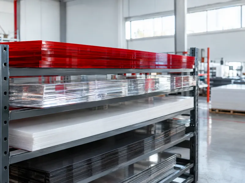
Sheet Products
17 products
Tool
Choose who reads the sign, at what speed and from how far; see the letter height you need or how far a letter can be read.
Quick start
The speed limit or typical speed, for example 50 (5–150 km/h).
Metres; you can type "12.5" or "12.5 m". 0.5–1000 m.
Height of a capital letter in cm; you can type "50" or "0.5 m". 1–1000 cm.
For drivers the viewing distance comes from speed and reading time.
Keep on for a business sign: the driver reads it, slows down and turns into the entrance.
Light box; the whole face glows
Sans-serif: Helvetica, Arial and similar. Serif: Clarendon, Times and similar.
Type the copy and the letters are counted.
Excluding spaces, for example 12 (1–60); each letter adds 0.1 s to the reading time.
Enter your values; the result appears here.
Legibility calculation
| Material | Quantity |
|---|
Notes
Channel letter LED calculation for these letters
Time a driver needs to notice the sign, read it and act on it (USSC).
Source: USSC Foundation, Guideline Standards for On-Premise Signs (2018). Pedestrian rules of thumb from Printerflo and Pannier.
Could not copy automatically. Select the link and copy it.
Approximate estimate; check dimensions before ordering.
This result is an approximate preliminary estimate; dimensions and product values must be checked before ordering materials and before production. Contact our branch for exact quantities and prices.
Four steps to a legible sign.
On an internally lit sign with capital letters, 1 cm of letter height reads from about 3 m in good conditions (USSC legibility index 25 ft/in). A 50 cm letter therefore reads from about 150 m. On a busy street this drops by 17–33 %; for pedestrians the conservative trade rule is 1 cm of letter = 1.2 m.
On a city street, a 20-letter sign needs about 8.8 s of reading time, which is 122 m of viewing distance. With internally lit black-on-white capitals in a moderately busy setting, the minimum is 49 cm and the recommended height 50 cm.
The time a driver needs to notice the sign, read it, change lanes and turn is almost constant. When speed doubles, the distance covered in that time doubles, and so do the viewing distance and the letter height.
At the same height, upper and lower case copy is legible about 15–20 % further away than ALL CAPS, because word shapes are more familiar. Capitals still work well for logos and short brand names.
The formula is based on USSC research in the United States and uses the average of test track measurements. On real roads legibility can drop by at least 35 %, which is why the tool also shows a “comfortable” value. Local regulations and facade size also affect the final decision.
17 products
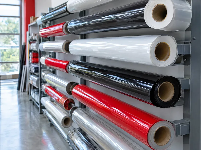
15 products